BECAUSE COFFEE IS A FRUIT.
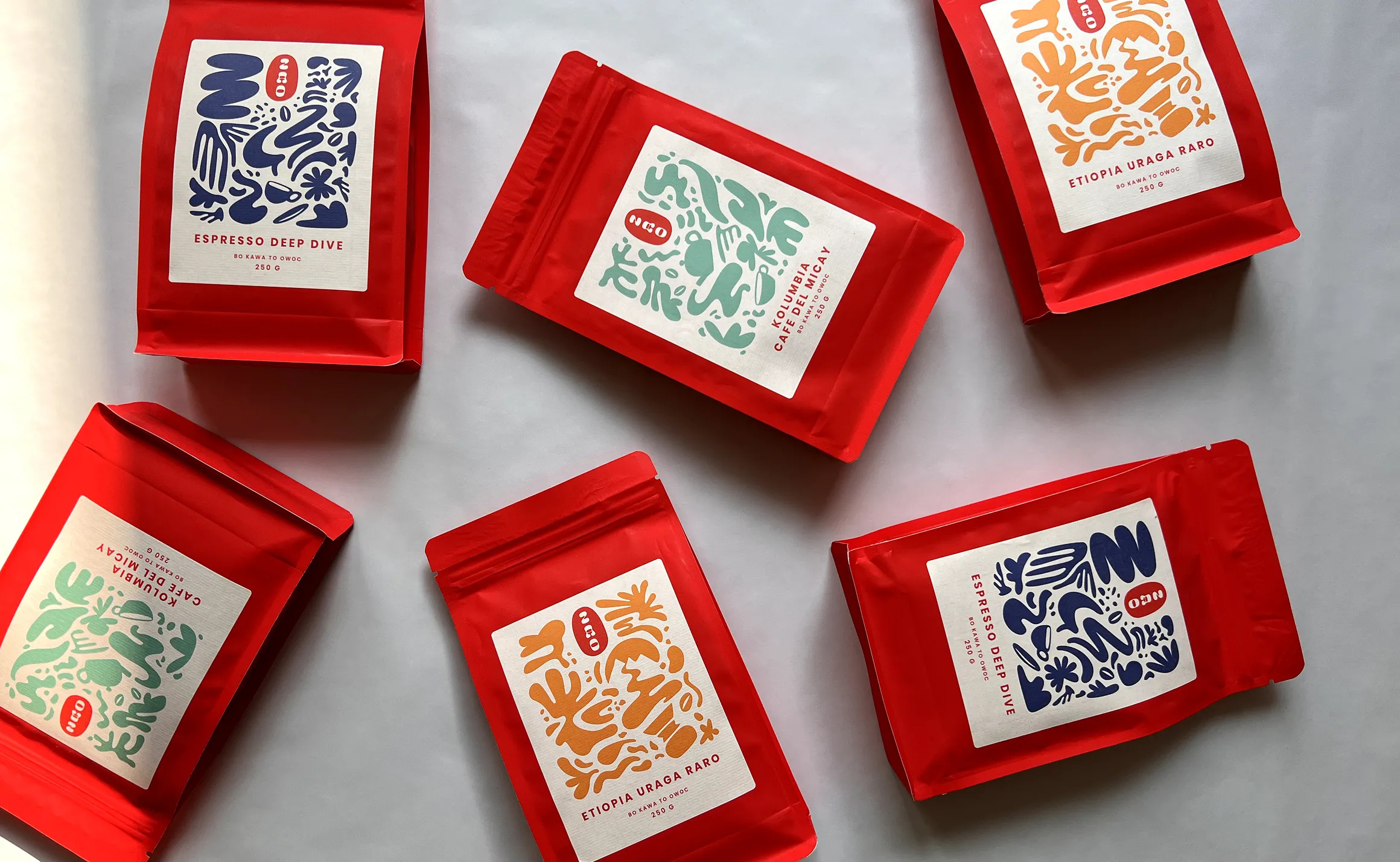
Branding and online store for coffee roasters.
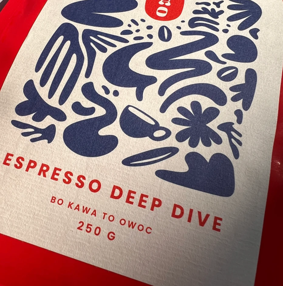
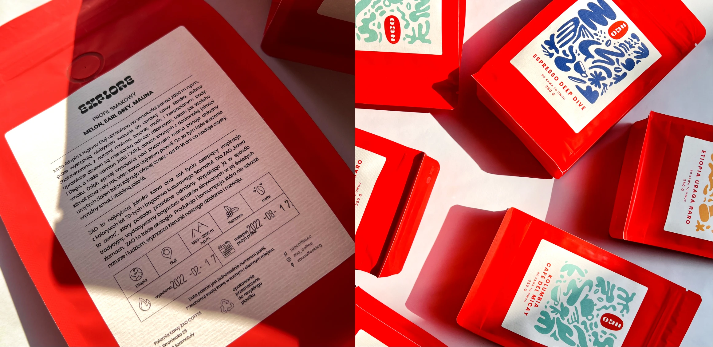
Launching a distinctive visual identity and packaging system that strips away the noise to focus entirely on the origin, roast, and raw quality of the bean.
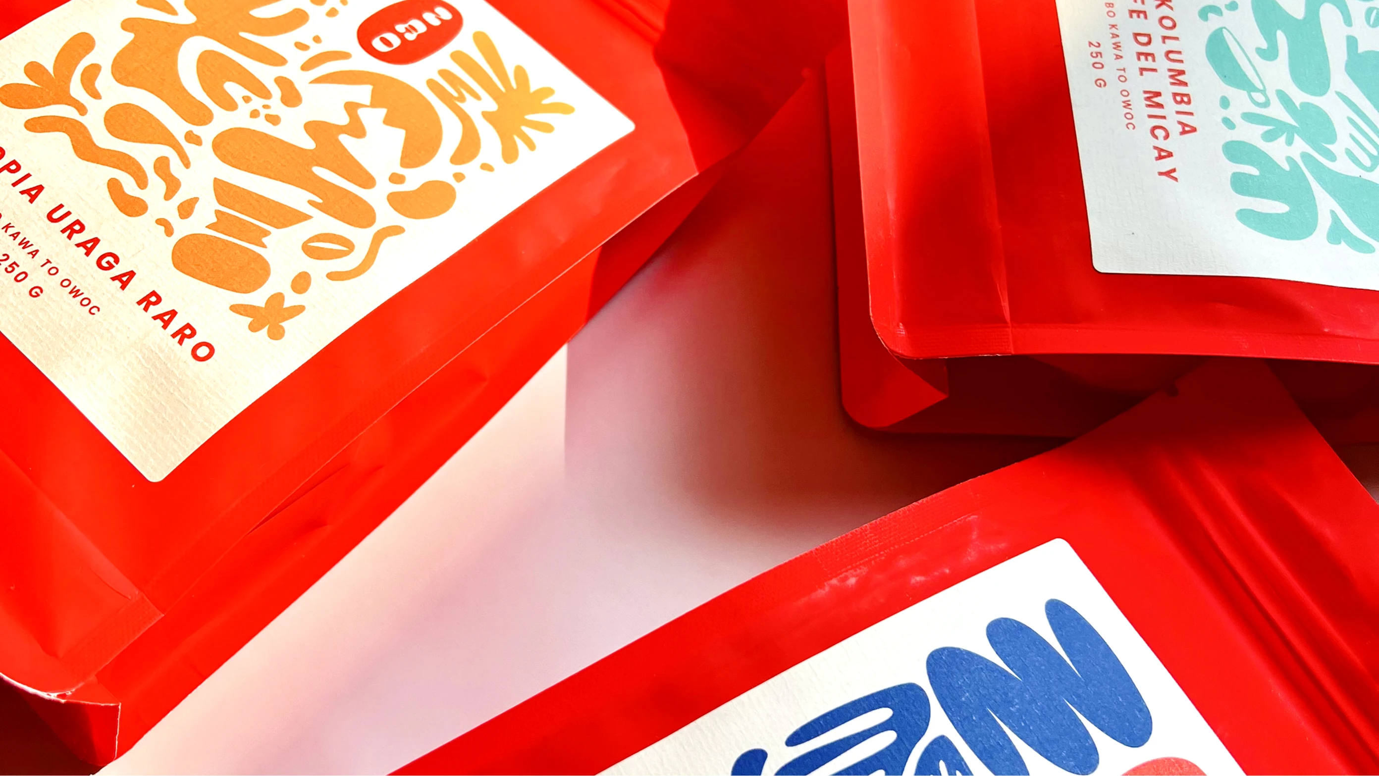
The core problem is that coffee brands all look the same—trapped in a loop of classic brown tones, gold lettering, and predictable corporate visuals.Our ultimate goal was to break this monotony and show the true passion, deep understanding, and raw mood that a real cup of coffee carries.
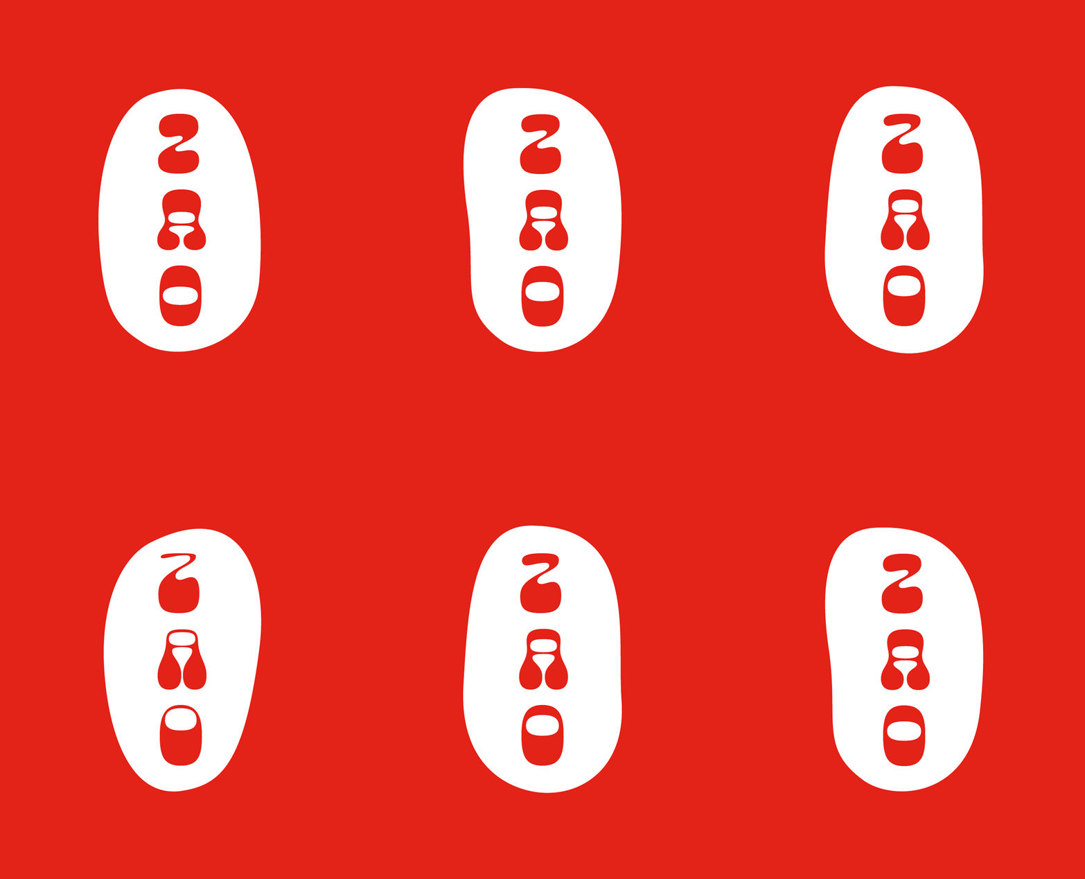
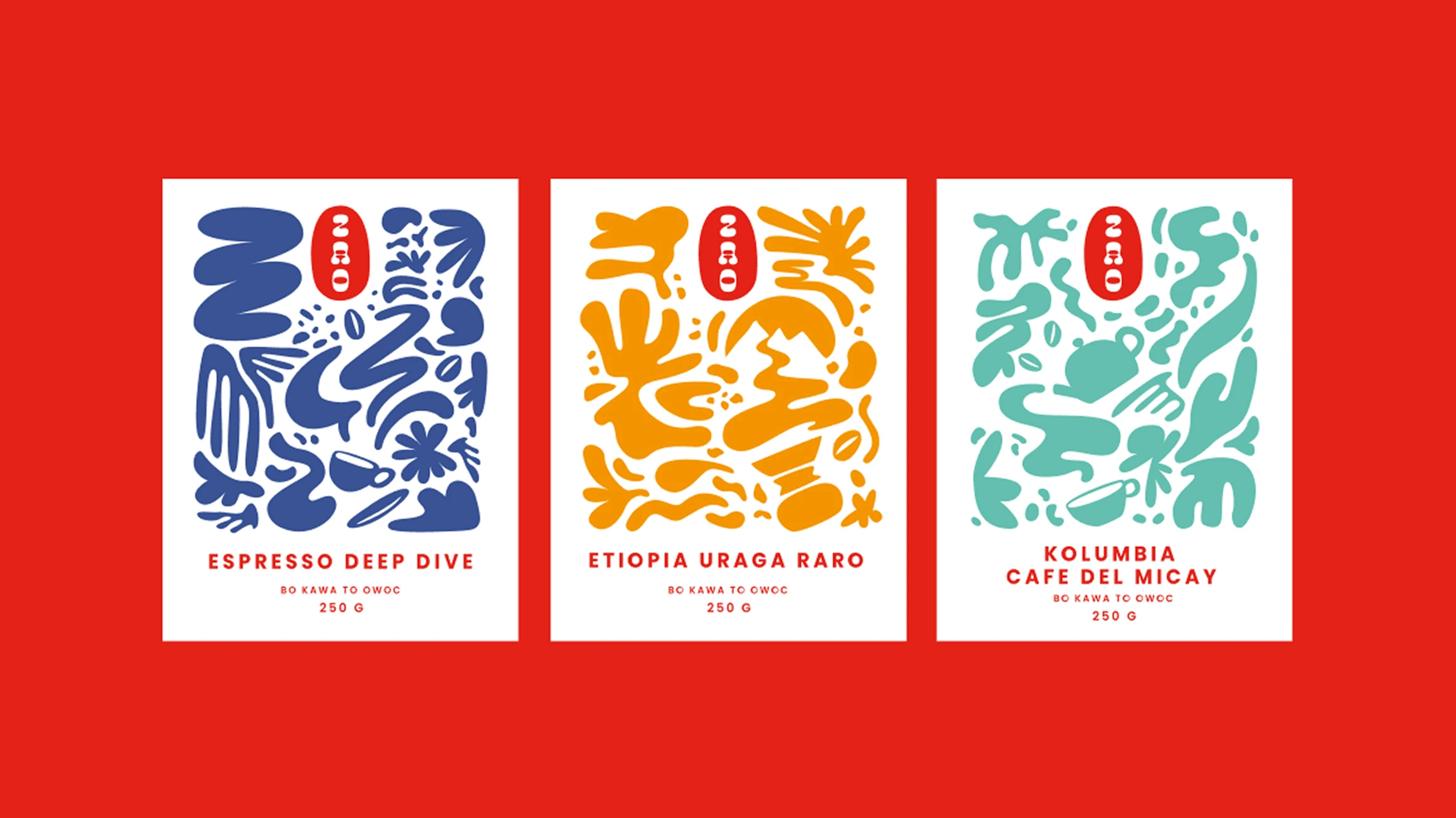
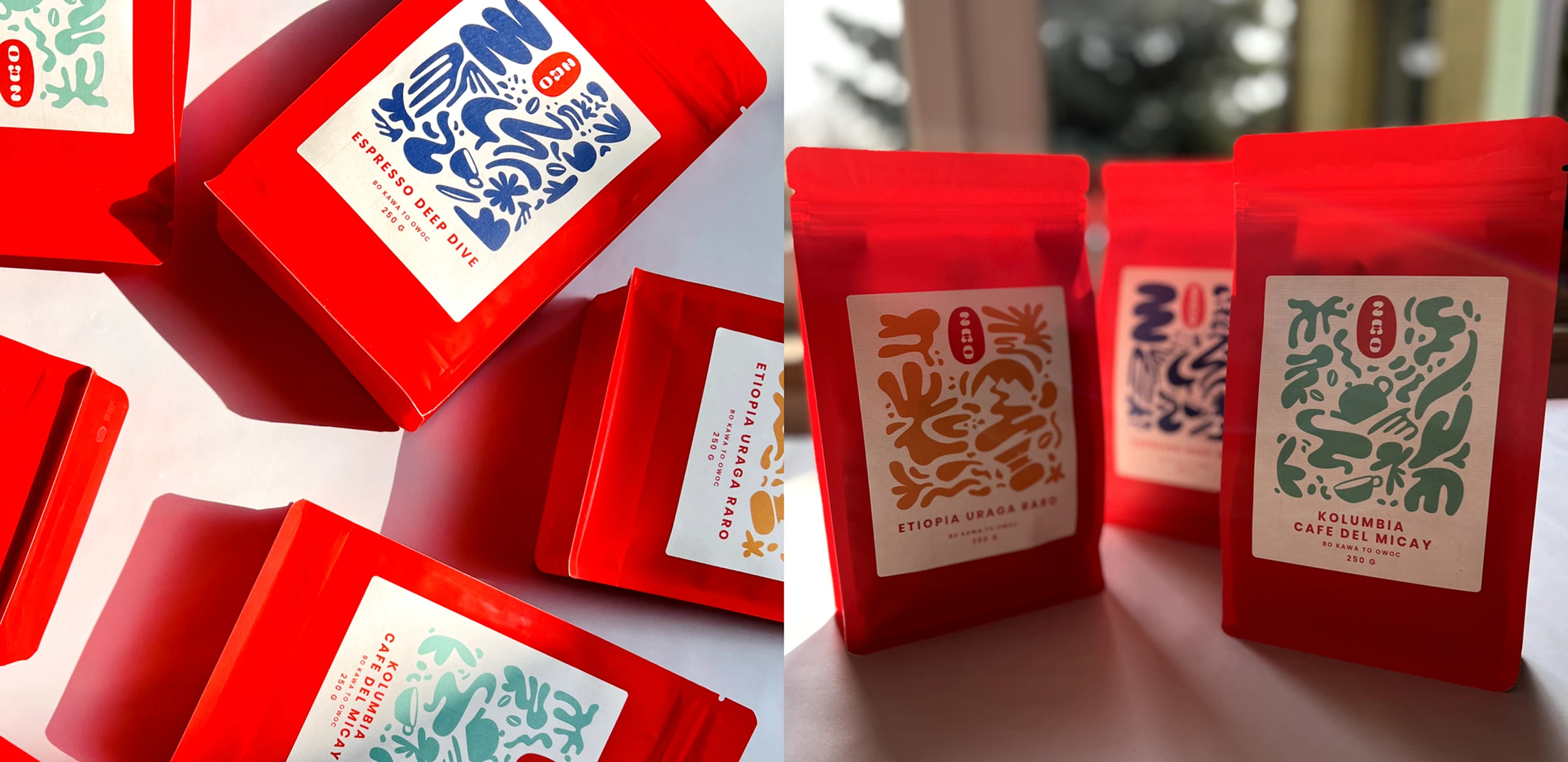
The solution came naturally because ZAO means fruit in Swahili. Because originally coffee is a fruit.

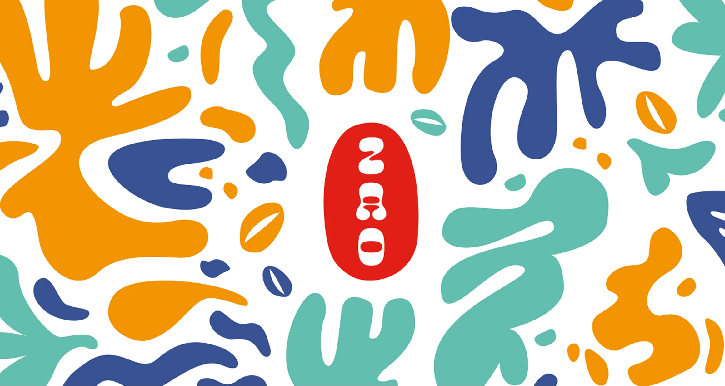
Sara and Mikołaj, brand owners, believe that to see the crops, you have to sow a seed. With small, deliberate steps, they built their wonderful coffee roasting plant in Szamotuły and invited us to shape their identity. Driven by passion, diligence, friendship, and our shared hometown, we crafted the ZAO branding — proving that coffee isn't just beverage; it's a living, bright, colourful and breathing culture.